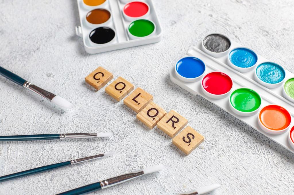
Color Psychology in Interior Design: Turn Spaces into Feelings
Chosen theme: Color Psychology in Interior Design. Discover how hues shape mood, behavior, and daily rituals—so you can design rooms that calm, energize, focus, and welcome. Share your color stories and subscribe for fresh, research-informed inspiration.
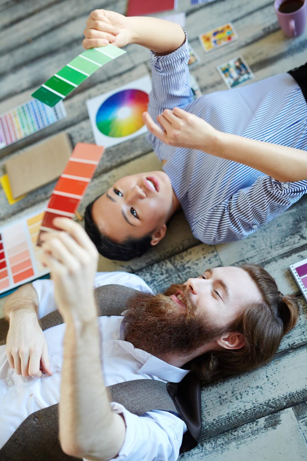
Foundations of Color Psychology
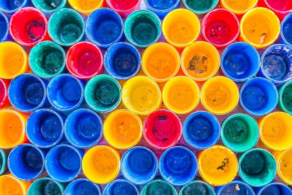
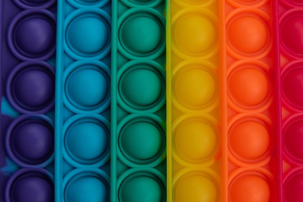
Hue, Saturation, and Value Demystified
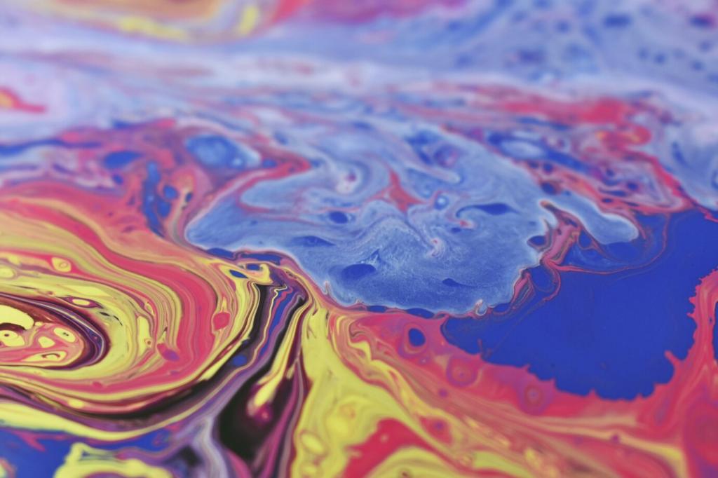
Hue sets the emotional direction, saturation turns the volume up or down, and value controls lightness and depth. Together they determine whether blue feels breezy or brooding, red feels playful or intense. Test swatches in real light and take notes.
Color meanings are not universal; they are filtered through culture and memory. A cheerful yellow might echo a beloved childhood kitchen, while another person prefers green after peaceful hikes. Tell us your associations to guide your unique palette.
Paint on plaster looks different than paint on wood, and natural daylight shifts undertones hour by hour. Textiles absorb light; metals reflect it. Always judge colors on the intended material and revisit them morning, noon, and evening before deciding.
Warm, muted tones like terracotta, peach, or dusty coral subtly raise social energy without shouting. Balance with grounding neutrals and textured throws. Share photos of your gathering spaces, and tell us which shades spark your best conversations.
Bedrooms that Restore and Soothe
Gentle blues, sage greens, and smoky lavenders align with relaxation and slower heart rates. Keep saturation low, layer soft lighting, and choose matte finishes. What nighttime hues calm your mind? Comment with your sleep-improving palettes and routines.
Kitchens and Dining that Nourish
Fresh greens and soft yellows suggest vitality and brightness, supporting appetite and morning momentum. Reserve bold reds as accents to avoid overwhelm. Try colored stools or art first, then evaluate. Subscribe for seasonal palette updates you can test easily.
Stories from Real Homes
01
After restless nights, Maya swapped a beige wall for a desaturated blue-green. She reported slower evenings and fewer screens in bed. The shift was small but felt profound. What single wall could change your routine? Share your candidate color below.
02
A compact apartment corner became a coral reading nook with a cinnamon throw and brass lamp. Friends lingered longer, and weeknight chats replaced mindless scrolling. Post your nook updates; we love before-and-after photos and the tales behind them.
03
A home office in mid-tone olive reduced glare from monitors and softened stress during deadlines. Plants amplified the calm. Productivity rose without feeling hyper. What shade supports your focus sprints? Comment with hex codes or paint names to compare.
Materials, Finishes, and Feelings
Matte absorbs light, diffusing intensity for calm spaces, while gloss reflects energy, highlighting details. Eggshell balances both. Use matte in bedrooms, satin in kitchens for wipeability. Which finish changed a room most for you? Tell us your experience.
Materials, Finishes, and Feelings
Bouclé softens cool colors, leather warms cool grays, and linen keeps whites from feeling stark. Repeating one texture across rooms stitches the palette together. Try textured pillows before repainting. Share your favorite tactile pairing with a quick snapshot.
Materials, Finishes, and Feelings
Wood tones, stone, and plants harmonize with greens, browns, and soft blues. These palettes reduce stress and increase perceived comfort. Start with a single plant and a nature-inspired print. Subscribe for monthly biophilic palette prompts and plant tips.
North vs. South-Facing Rooms
North light is cool and consistent, exaggerating blue undertones; south light is warm and shifting, flattering warm hues. Adjust saturation accordingly. Share your room orientation and challenges, and we’ll suggest balanced options in our next newsletter.
Bulb Temperature and CRI
Use warmer bulbs in restful zones and neutral, high-CRI bulbs where true color accuracy matters, like kitchens or studios. Dimmer switches help moods transition gracefully. What bulbs are in your spaces now? Comment, and we’ll help fine-tune your mix.
Layered Lighting for Emotional Rhythm
Combine ambient, task, and accent lighting to let colors flex from morning alertness to evening calm. A picture light can warm a cool wall; a floor lamp can cool a warm scheme. Tell us your favorite lamp and why it earns daily use in your routine.
Try, Test, and Tweak
Start with pillows, art, or an accent chair before painting every wall. Track how you feel over a week. If energy rises and stress falls, scale up. Share your micro-experiments in the comments to encourage others to take that first colorful step.